Pinterest UI/UX Part 1: Visual Appeal
Visual appeal refers to the aesthetics and overall visual presentation of a platform or interface. In the context of Pinterest, visual appeal plays a significant role in its UI/UX design. Here are some key aspects that contribute to Pinterest’s visual appeal:
Contents
High-Quality Images
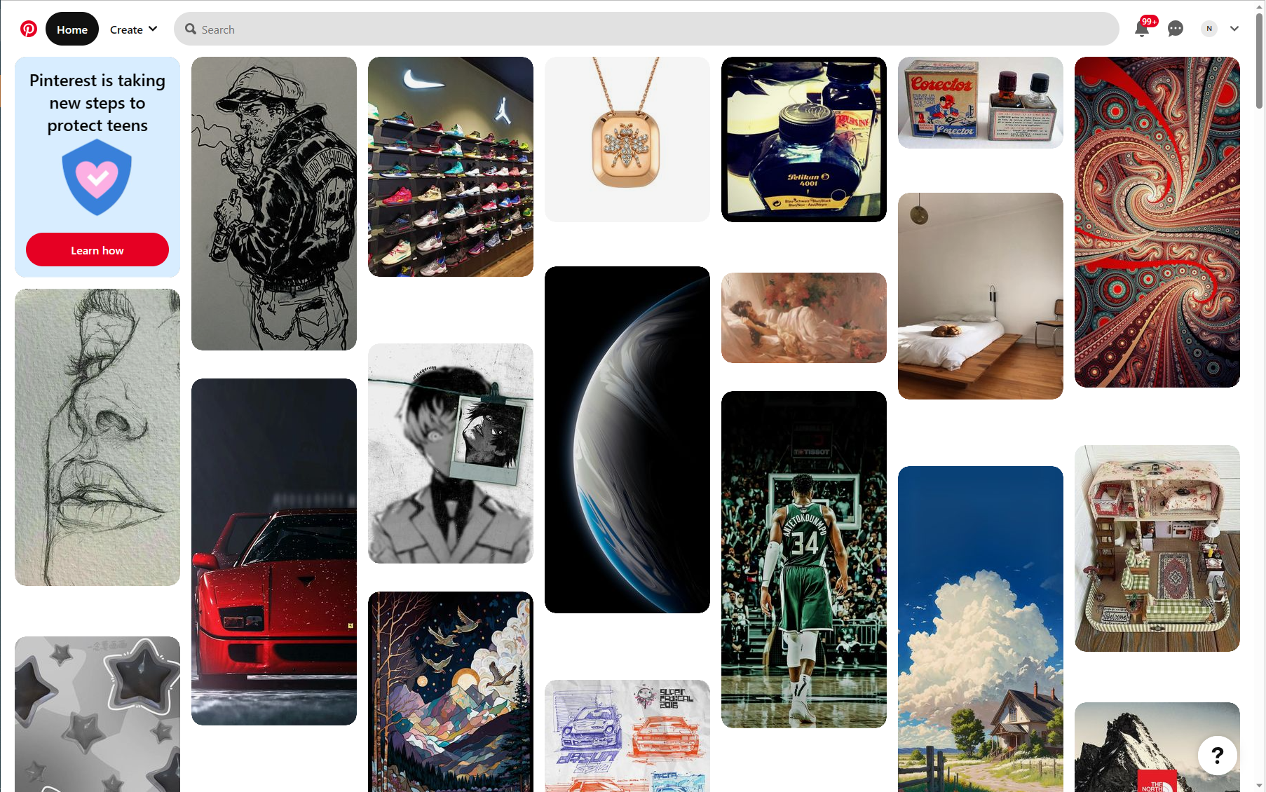
Pinterest showcases a vast collection of images, and the platform encourages users to pin and share visually compelling content. The images displayed are typically of high quality, captivating, and visually appealing. This emphasis on high-quality visuals enhances the overall experience and grabs users’ attention.
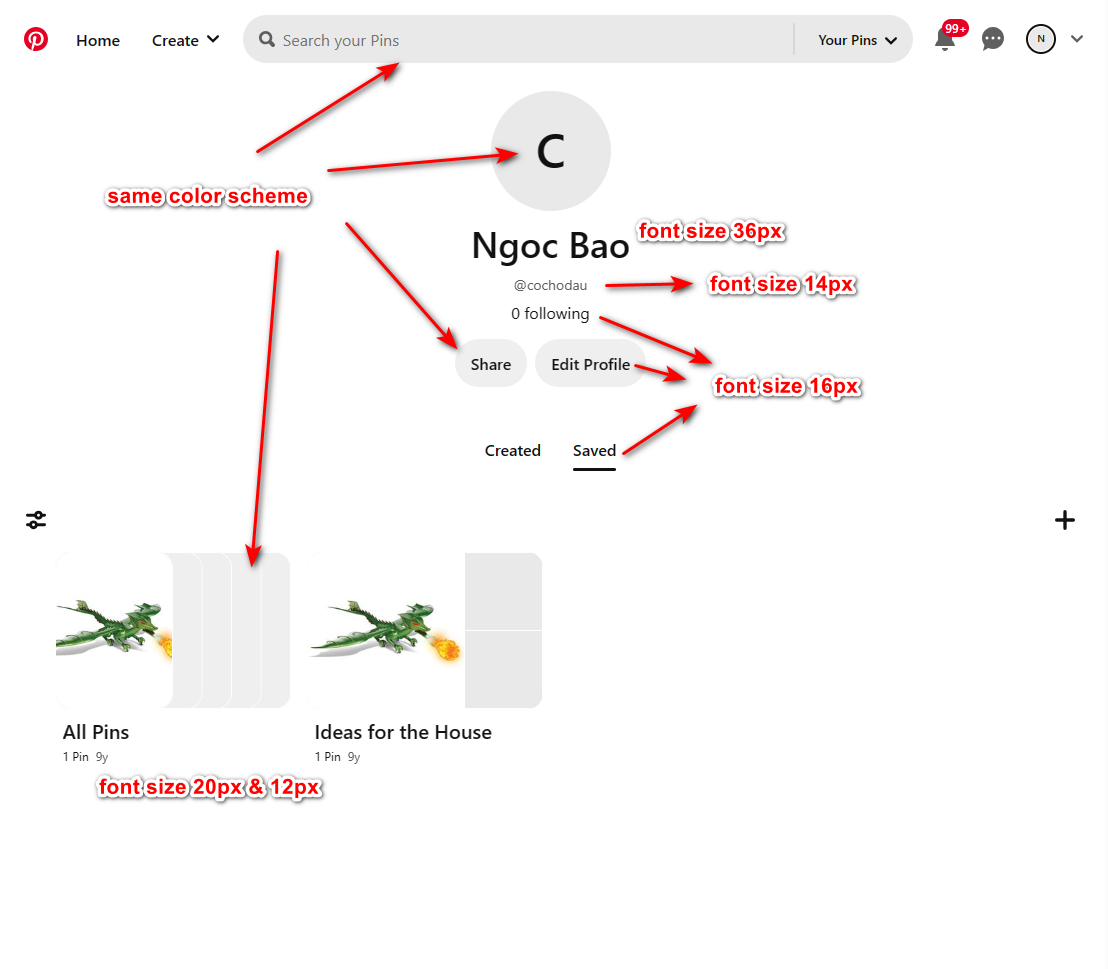
Consistent Design Language
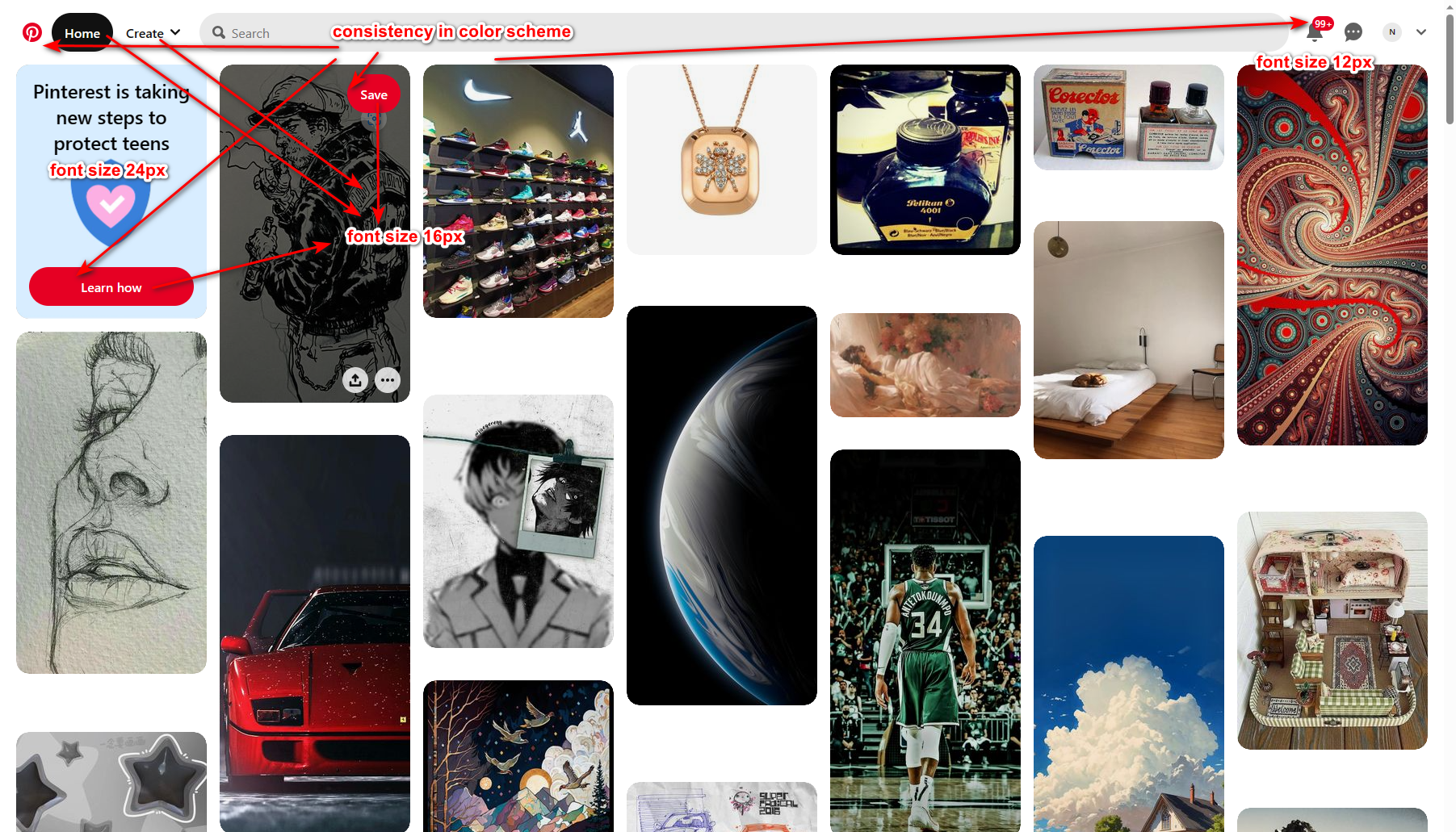
Pinterest maintains a consistent design language throughout its interface. It utilizes a clean and modern design with a minimalistic approach. Consistency in typography, color schemes, and layout creates a cohesive visual experience, making it easy for users to navigate and interact with the platform.
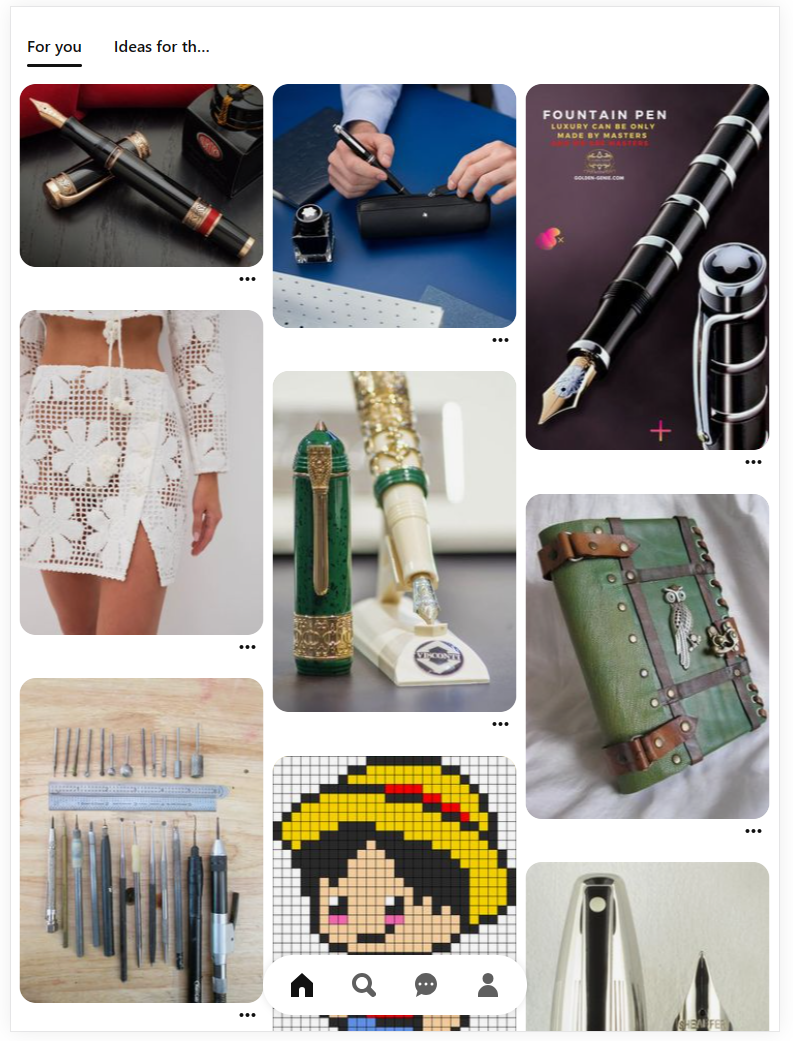
Grid-Based Layout
Pinterest’s grid-based layout allows for the display of numerous images in a visually pleasing and organized manner. The grid structure aligns the images neatly, creating a sense of order and symmetry. This layout also enables users to quickly scan and browse through multiple images without feeling overwhelmed.
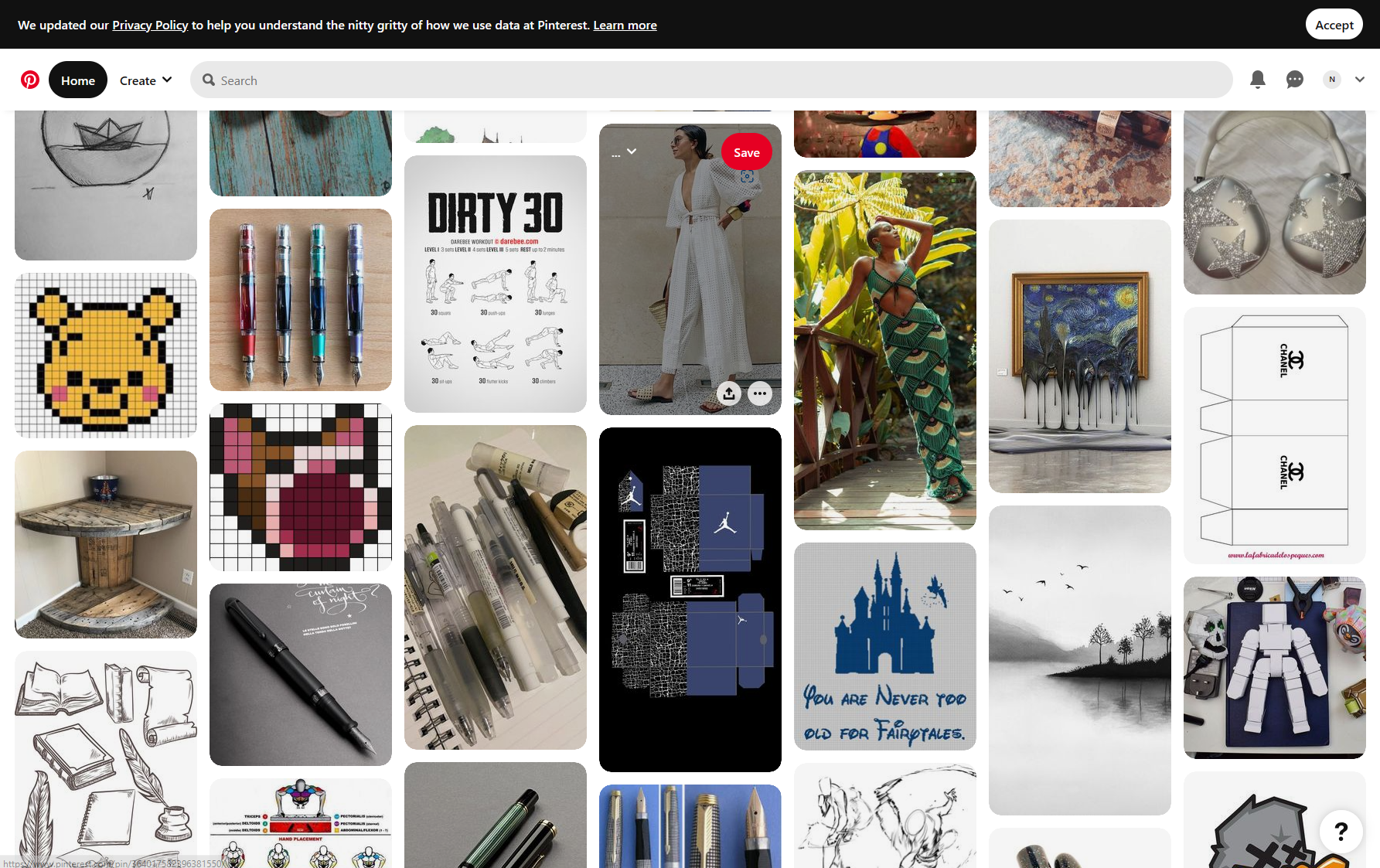
There’re some interesting points here:
– All the grids have the same width. It seems that the grid is more suitable for portrait images than landscape ones. The landscape ones will be small. For example: the ink bottle image on the top right.
– The gap between the images in the same row is equal to the gap between the images in the same column.
– The curve border makes the grid softer and easier for the eyes.
– Easier to make responsive works.
Color and Contrast
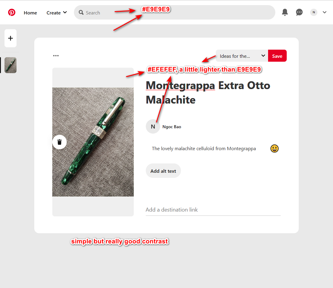
Pinterest employs a thoughtful use of colors to create a visually appealing interface. The color palette is often vibrant and eye-catching, while maintaining readability and accessibility. The contrast between different elements, such as images, text, and buttons, ensures clarity and helps users focus on the content.
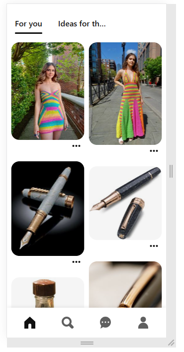
Clear Hierarchy and Visual Hierarchy
Pinterest employs a clear hierarchy in its design, ensuring that important elements are prominent and easily identifiable. This includes using appropriate sizes, positioning, and visual cues to guide users’ attention. The visual hierarchy allows users to quickly understand the structure of the page and find relevant information or actions.

The web mobile layout is designed like we’re using mobile app, not web. Only the important features are displayed here:
– Content categories are on the top.
– Contents with “…” for more actions at the center.
– Navigation buttons are on the bottom.
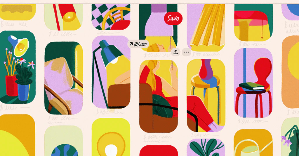
Negative Space
Effective use of negative space, also known as white space, is crucial for visual appeal. Pinterest utilizes ample white space to create a sense of balance and breathing room between images and other elements. This helps users focus on individual images and reduces visual clutter, leading to a more enjoyable experience.
Responsive Design
Pinterest’s visual appeal extends to its responsiveness across different devices and screen sizes. The platform adapts its layout and design elements to fit the specific screen dimensions, ensuring that the visuals remain engaging and optimized, whether accessed on a desktop computer, tablet, or mobile device.