Pinterest UI/UX Part 2: Intuitive navigation
Intuitive navigation refers to the ease with which users can move through a platform or interface, find what they’re looking for, and understand how to interact with the different features. In the case of Pinterest, intuitive navigation is a key aspect of its UI/UX design. Here are some elements that contribute to Pinterest’s intuitive navigation:
Contents
Clear and Simple Menu Structure
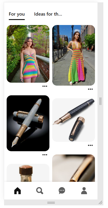
Pinterest utilizes a clear and simple menu structure that allows users to navigate through the platform effortlessly. The main navigation menu typically consists of categories such as home, explore, following, and profile. This straightforward structure helps users quickly locate the desired sections and access the content they’re interested in.
Search Functionality
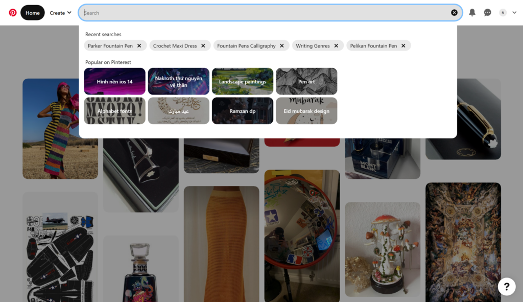
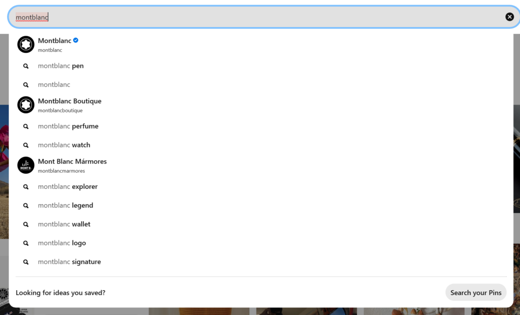
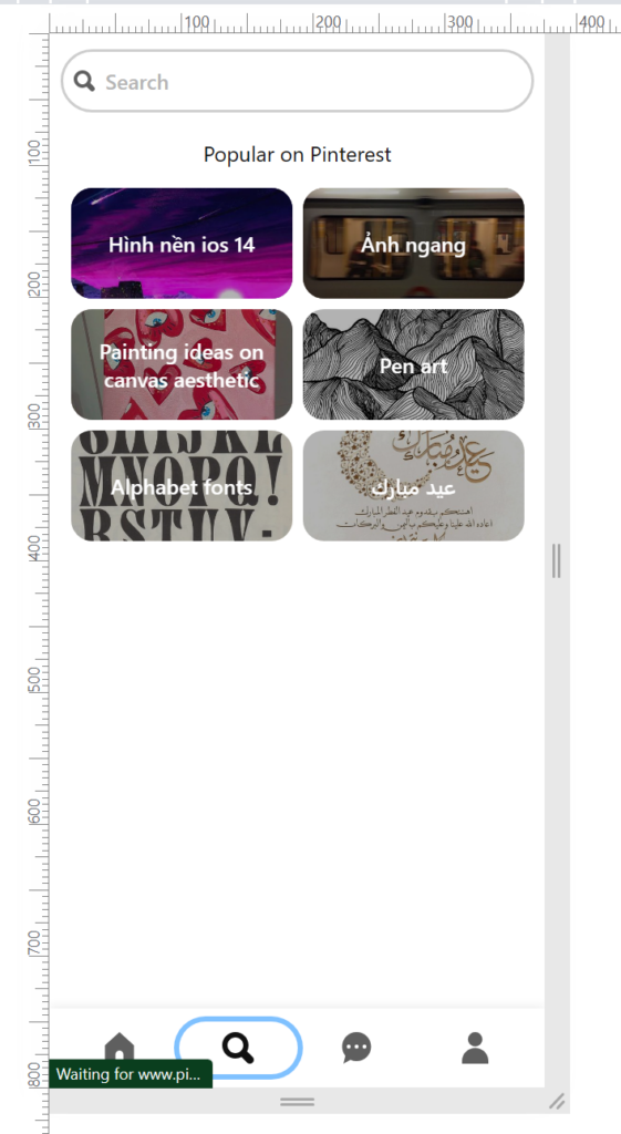
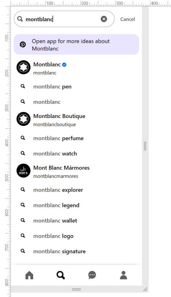
Pinterest prominently displays its search functionality, making it easy for users to find specific content. The search bar is typically located at the top of the interface, providing users with immediate access to search for pins, boards, or specific topics of interest. As users type, Pinterest often provides auto-suggestions to refine the search query, enhancing the search experience.
Board and Pin Organization
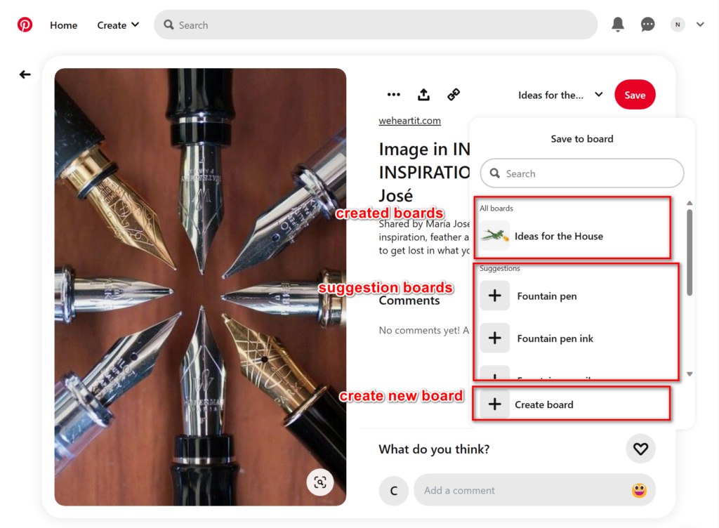
Pinterest’s organization system revolves around boards and pins. Users can create their own boards to categorize and save content. The ability to easily create, edit, and organize boards helps users keep their content well-structured and allows for efficient navigation between different collections.
Visual Thumbnails and Previews
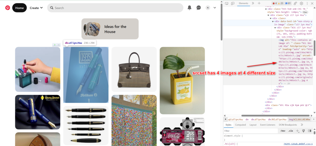
Pinterest relies heavily on visual thumbnails and previews to provide users with a glimpse of the content before they click or interact. These visuals, usually represented by images or graphics, help users quickly assess the relevance and appeal of the content. Thumbnails and previews also serve as clickable entry points to view the complete pin or board.
The srcset attribute contains 4 different image sizes:
– 236x
– 474x
– 736x
– original
In the PC homepage, the thumbnails are using the smallest image size for better loading speed. Pinterest will check the screen size and element size to choose which image to use.
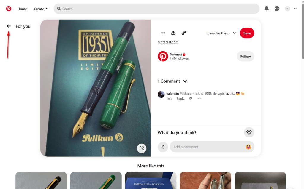
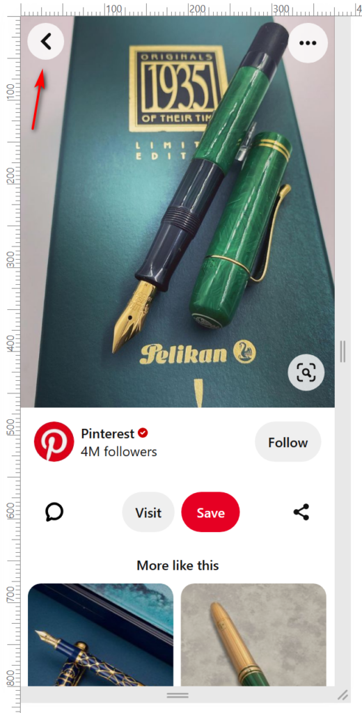
Pinterest implements a backward navigation feature, typically in the form of a back button or arrow, allowing users to easily return to their previous location or view. This navigation element helps users explore and backtrack without losing their context, promoting a seamless browsing experience.
User-Friendly Notifications
Pinterest employs user-friendly notifications to keep users informed about relevant activities, such as new pins, comments, or board updates. These notifications are typically displayed as badges or alerts, ensuring users stay engaged and can easily access the latest updates or interactions.
Consistent Iconography and Labels
Pinterest uses consistent iconography and labels to guide users and convey the purpose of different features. Icons and labels are typically intuitive and well-designed, making it easier for users to understand the functionality of various buttons, menus, and interactive elements.
Conclusion
By focusing on a clear menu structure, robust search functionality, effective organization of boards and pins, visual thumbnails and previews, backward navigation, user-friendly notifications, and consistent iconography and labels, Pinterest provides an intuitive navigation experience. These elements help users find, explore, and engage with content effortlessly, resulting in a seamless and user-friendly interface.
