How to build a component library with React and TypeScript
Original post: How to build a component library with React and TypeScript – LogRocket Blog
Editor’s note: This guide to building a component library with React and TypeScript was last updated on 27 April 2023 to reflect recent changes to React and to include new sections defining and exploring the benefits of component libraries. This article was reviewed by Timonwa Akintokun.
React is still the most famous frontend library in the web developer community. When Meta (previously Facebook) open sourced React in late 2013, it made a huge impact on single-page applications (SPAs) by introducing concepts like the virtual DOM, breaking the UI into components, and immutability.
React has evolved a lot in the past few years, and with the introduction of TypeScript support, Hooks, Suspense, and React Server Components, we can assume that React will still hold the crown for best frontend tool. React has opened the doors to some awesome projects like Next.js, Gatsby, and Remix, which focus more on improving the developer experience.
Along with this robust React ecosystem is a wide variety of component libraries, like Material UI, Chakra UI, and React-Bootstrap. When you come across these awesome tools and libraries, have you ever wondered how they are made? Or what would it take to create your own UI component library with React?
In this article, we’ll learn what a component library is and how to build our component library with React and TypeScript. We’ll also publish it to npm so that you, too, can contribute to React’s ever-growing community of projects. But first, let’s talk about what a component library is.
Contents
- 1 What is a component library?
- 2 Why build a component library?
- 3 Required tools and project structure
- 4 Building the component library
- 5 Creating components
- 6 But why so many index.ts files and exports?
- 7 Configuring TypeScript and Rollup
- 8 Integrating Storybook into our library
- 9 Testing with Jest and React Testing Library
- 10 Modifying the package.json dependencies
- 11 Packaging and publishing to npm
- 12 Conclusion
What is a component library?
A component library is a collection of reusable UI components that can be shared across different projects and applications, typically implemented in code. Component libraries ensure UI consistency across different applications and teams. These components can be anything from buttons and forms to complex UI elements like carousels or calendars. By using a component library, developers can save time and effort by not having to reinvent the wheel each time they create a new application. Instead, they can reuse pre-built, well-tested components or features designed to work together seamlessly.
Why build a component library?
There are several reasons why one might want to build a component library. First, a component library provides a set of pre-built UI components that can be used across multiple projects. It ensures consistency in the design and behavior of the components and saves time and effort by not having to build the same components from scratch for every project.
Component libraries also allow for easy scaling of UI development and allow for easier maintenance and updates of existing features. Additionally, component libraries promote collaboration and communication among team members by providing a shared library of components that all members can easily access and use. This ensures that everyone is on the same page regarding the design and functionality of the components.
Brand consistency is important. Fortunately, component libraries help maintain brand consistency by providing a set of pre-defined styles and components that adhere to the brand guidelines. This ensures all components, features, and projects align with the brand image and messaging.
Accessibility is essential to all aspects of the web, and component libraries can also ensure accessibility compliance by providing pre-built components that follow accessibility guidelines and best practices. This helps to ensure that all users can access and use the components.
Required tools and project structure
Creating a UI library is quite different from creating a web application. Instead of using popular tools like Next.js or Create React App, we have to start from scratch. To build this UI library, we’ll use the following tools.
TypeScript
There’s no doubt that TypeScript is the go-to method when developing with JavaScript. TypeScript will save us a ton of time because it introduces types and compile time checking. In addition, TypeScript will be helpful when we build components for our library because we will be dealing with props in React components, and defining types will avoid issues when passing props to the components.
Rollup
We will need some custom configurations for our library. Rollup is an excellent middle ground between popular JavaScript bundlers because it is more customizable than Parcel but requires less configuration effort than webpack.
Storybook
We are building components, so we need a way of visualizing them in an isolated environment. Storybook does that for us because it spins up a separate playground for UI components.
Jest and React Testing Library
Jest is a complete testing framework with a test runner plus an assertion and mocking library. It also lets the user create snapshot tests for components, which is ideal when building components in React. React Testing Library helps us write tests as if a real user is working on the elements.
To organize our library, we will create a directory for each component named after the component itself. This directory will contain all the necessary files for that component, including a type definition file, a story file for documentation purposes, and a test file. Additionally, the component file(s) will be included, as well as an index.ts file to export all the components within that directory.
All component directories will be grouped into a single directory called "components", which will be located in the "src" directory, which is, in turn, located in the "root" directory of our library.
Building the component library
To build our component library, we start by creating a local repository on our system. Create an empty folder and give it the name of your choice for your library. Open the folder in your preferred code editor, and initialize it as a JavaScript project by running the following command in the terminal:
npm init
This command will generate a package.json file in the root directory and prompt us for information about the project, such as the project name, version, description, author, license, repository, and scripts. Now, install React and TypeScript to our project through the following command:
npm i -D react typescript @types/react
Notice that we are passing the flag -D because we need to install it as devDependencies rather than a project dependency; we’ll need those dependencies when we are building the bundle.
Please note that this library will be used in a React project in the future. So, before publishing the library, it’s important to move some of the packages currently installed as
"devDependencies"to"peerDependencies"or"dependencies". ThepeerDependencieswill be packages that the library needs to function properly in a project, while thedependencieswill be packages that are required for the library to work as intended. It’s recommended to move these packages before publishing the library to ensure that it works seamlessly with other projects.
Creating components
Now that we have added React and TypeScript, we can start creating our components, beginning with a button. All files relating to our Button component will be placed inside the src/components/Button directory. Because this is a TypeScript project, we first create the type definitions for the components, which I’m naming Button.types.ts:
import { MouseEventHandler } from "react";

export interface ButtonProps {
  text?: string;
  primary?: boolean;
  disabled?: boolean;
  size?: "small" | "medium" | "large";
  onClick?: MouseEventHandler<HTMLButtonElement>;
}
This file consists of all the props of the button, including the onClick event, and the MouseEventHandler tells that the onChange prop is responsible for a mouse event. We will use these props in the button component to add or enable different properties. Now, let’s move on to the creation of the button component itself.
In this project, we will not be using regular CSS. Instead, we will be using CSS-in-JS. CSS-in-JS provides many benefits over regular CSS, for example:
- Reusability: Because CSS-in-JS is written in JavaScript, the styles you define will be reusable JavaScript objects, and you can even extend their properties
- Encapsulation: CSS-in-JS scopes are generated by unique selectors that prevent styles from leaking into other components
- Dynamic: CSS-in-JS will allow you to dynamically change the properties of the styling depending on the value that the variables hold
There are many ways to write CSS-in-JS in your component, but for this tutorial, we will be using one of the most famous libraries — styled-components. You can run the following commands to install the styled-components dependencies along with the type definitions for TypeScript support:
npm install -D styled-components @types/styled-components
Now, let’s create our button component. Still, in the src/components/Button folder, create a file called Button.tsx and include the following code:
import React from "react";
import styled from "styled-components";
import { ButtonProps } from "./Button.types";

const StyledButton = styled.button<ButtonProps>`
  border: 0;
  line-height: 1;
  font-size: 15px;
  cursor: pointer;
  font-weight: 700;
  font-weight: bold;
  border-radius: 3px;
  display: inline-block;
  padding: ${(props) =>
    props.size === "small"
      ? "7px 25px 8px"
      : props.size === "medium"
      ? "9px 30px 11px"
      : "14px 30px 16px"};
  color: ${(props) => (props.primary ? "#1b116e" : "#ffffff")};
  background-color: ${(props) => (props.primary ? "#6bedb5" : "#1b116e")};
  opacity: ${(props) => (props.disabled ? 0.5 : 1)};
  &:hover {
    background-color: ${(props) => (props.primary ? "#55bd90" : "#6bedb5")};
  }
  &:active {
    border: solid 2px #1b116e;
    padding: ${(props) =>
      props.size === "small"
        ? "5px 23px 6px"
        : props.size === "medium"
        ? "7px 28px 9px"
        : "12px 28px 14px"};
  }
`;

const Button: React.FC<ButtonProps> = ({
  size,
  primary,
  disabled,
  text,
  onClick,
  ...props
}) => {
  return (
    <StyledButton
      type="button"
      onClick={onClick}
      primary={primary}
      disabled={disabled}
      size={size}
      {...props}>
      {text}
    </StyledButton>
  );
};

export default Button;
If you go through the code above, you will notice something special. We have defined a variable called StyledButton to which we assign styling properties through special tags called tagged template literals, a new JavaScript ES6 feature that enables you to define custom string interpolations.
These tagged templates are used to write the StyledButton variable as a React component that you can use like any other. Notice that we also have access to the component props inside these specially tagged templates. After that, we create a index.ts file and export our Button.tsx file in it like so:
export * from "./Button";
Building an input component
Now, let’s create an input component in the src/components/Input folder, starting first with its type definitions by creating a file called Input.types.ts:
import { ChangeEventHandler } from "react";

export interface InputProps {
  id?: string;
  label?: string;
  error?: boolean;
  message?: string;
  success?: boolean;
  disabled?: boolean;
  placeholder?: string;
  onChange?: ChangeEventHandler<HTMLInputElement>;
}
Like in the previous component, we have defined the prop attributes in the Input.types.ts file. We also have an onChange event and assigned ChangeEventHandler<HTMLInputElement> from React to it. This tells that the onChange prop is responsible for an input change event. Finally, let’s create the input component called Input.tsx:
import React, { FC, Fragment } from "react";
import styled from "styled-components";
import { InputProps } from "./Input.types";

const StyledInput = styled.input<InputProps>`
  height: 40px;
  width: 300px;
  border-radius: 3px;
  border: solid 2px
    ${(props) =>
      props.disabled
        ? "#e4e3ea"
        : props.error
        ? "#a9150b"
        : props.success
        ? "#067d68"
        : "#353637"};
  background-color: #fff;
  &:focus {
    border: solid 2px #1b116e;
  }
`;

const StyledLabel = styled.div<InputProps>`
  font-size: 14px;
  color: ${(props) => (props.disabled ? "#e4e3ea" : "#080808")};
  padding-bottom: 6px;
`;

const StyledMessage = styled.div<InputProps>`
  font-size: 14px;
  color: #a9150b8;
  padding-top: 4px;
`;

const StyledText = styled.p<InputProps>`
  margin: 0px;
  color: ${(props) =>
    props.disabled ? "#e4e3ea" : props.error ? "#a9150b" : "#080808"};
`;

const Input: FC<InputProps> = ({
  id,
  disabled,
  label,
  message,
  error,
  success,
  onChange,
  placeholder,
  ...props
}) => {
  return (
    <Fragment>
      <StyledLabel>
        <StyledText disabled={disabled} error={error}>
          {label}
        </StyledText>
      </StyledLabel>
      <StyledInput
        id={id}
        type="text"
        onChange={onChange}
        disabled={disabled}
        error={error}
        success={success}
        placeholder={placeholder}
        {...props}></StyledInput>
      <StyledMessage>
        <StyledText error={error}>{message}</StyledText>
      </StyledMessage>
    </Fragment>
  );
};

export default Input;
In the above code, you can see that we have defined several styled-components and wrapped them together through a React fragment. We use a fragment because it enables us to group multiple sibling components without introducing any extra elements in the DOM. This will come in handy because there won’t be any unnecessary markup in the rendered HTML of our components. We will also create a index.ts file in the Input folder and export our Input.tsx file in it like so:
export * from "./Input";
After this, we then go into our components folder and create another index.ts file in the src folder and export the Button and Input components within it:
export * from "./Button";
export * from "./Input";
And, go into our src folder, create another index.ts, and export the index.ts file in the components folder into it:
export * from "./components";
But why so many index.ts files and exports?
In a library, it’s important to structure our code in a way that allows other developers to import and use our components easily. Creating an index.ts file in each component folder and exporting the component from there will enable us to have a single entry point for that component instead of importing the component file directly. For example, instead of having to import Button.tsx directly in our code like this:
import { Button } from "./components/Button/Button";
We can import it through the index.ts file in the src folder:
import { Button } from "your-library-name";
This makes the code more readable and allows us to change the location or name of the component file without changing all the import statements. Additionally, by exporting all the components in the src/index.ts file, we can provide a single entry point for all the components in our library.
This allows developers to import all the components simultaneously without having to import each separately. Overall, creating these index.ts files and exports helps improve the structure and organization of our code and makes it more convenient for other developers to use our library.
Configuring TypeScript and Rollup
Now, it’s time to configure TypeScript with Rollup. We are using TypeScript to build the components. In order to build the library as a module, we will need to configure Rollup along with it. In a previous step, we installed TypeScript to our project, so now we just need to add the TypeScript configurations.
For this, we can use TypeScript’s CLI to generate the file. Create a tsconfig.json file in the root directory and paste the code below into it so that it will fit our project scenario:
{
  "compilerOptions": {
    "esModuleInterop": true,
    "strict": true,
    "skipLibCheck": true,
    "jsx": "react",
    "module": "ESNext",
    "declaration": true,
    "declarationDir": "types",
    "sourceMap": true,
    "outDir": "dist",
    "moduleResolution": "node",
    "emitDeclarationOnly": true,
    "allowSyntheticDefaultImports": true,
    "forceConsistentCasingInFileNames": true
  },
  "exclude": [
    "dist",
    "node_modules",
    "src/**/*.test.tsx",
    "src/**/*.stories.tsx"
  ]
}
In the above code, you can see that we have added configurations like "skipLibCheck": true, which skips type checking declaration files. This can save time during compilation. Another special configuration is "module": "ESNext", which indicates that we will be compiling the code into the latest version of JavaScript (ES6 and above, so you can use import statements).
The attribute "sourceMap": true tells the compiler that we want source map generation. A source map is a file that maps the transformed source to the original source, which enables the browser to present the reconstructed original in the debugger. You will also notice that we have defined an "exclude" section in order to tell TypeScript to avoid transpiling specified directories and files so that it won’t transpile the tests and stories of our library.
Now that we have configured TypeScript, let’s begin configuring Rollup. First, install Rollup as a devDependencies project through the following command:
npm i -D rollup
However, installing Rollup is not enough for our project because we will need additional features, like the following:
- Bundling to CommonJS format
- Resolving third-party dependencies in
node_modules - Transpiling our TypeScript code to JavaScript
- Preventing bundling of
peerDependencies - Minifying the final bundle
- Generating type files (
.d.ts), that provide TypeScript type information about the components in our project
The above features will come in handy when we finally build and use the library as a package. CommonJS is a specification standard used in Node.js, and modules are loaded synchronously and processed in the order the JavaScript runtime finds them. Luckily, there are several plugins for Rollup that we can use for the above requirements, which can be installed through the following command:
npm i -D @rollup/plugin-node-resolve @rollup/plugin-commonjs @rollup/plugin-typescript rollup-plugin-peer-deps-external rollup-plugin-terser rollup-plugin-dts
If you encounter a
"Could not resolve dependency"error when configuring the packages above, you can either downgrade Rollup to v3.0.0, downgrade the version of the plugins that have the dependency issue to the version suggested in the terminal, or try running the command with the--forceoption.
Now that Rollup and its awesome plugins are installed, let’s move on to its configuration. Create a rollup.config.js file in the root of our project and add the following:
import resolve from "@rollup/plugin-node-resolve";
import commonjs from "@rollup/plugin-commonjs";
import typescript from "@rollup/plugin-typescript";
import dts from "rollup-plugin-dts";
import { terser } from "rollup-plugin-terser";
import peerDepsExternal from "rollup-plugin-peer-deps-external";

const packageJson = require("./package.json");

export default [
  {
    input: "src/index.ts",
    output: [
      {
        file: packageJson.main,
        format: "cjs",
        sourcemap: true,
      },
      {
        file: packageJson.module,
        format: "esm",
        sourcemap: true,
      },
    ],
    plugins: [
      peerDepsExternal(),
      resolve(),
      commonjs(),
      typescript({ tsconfig: "./tsconfig.json" }),
      terser(),
    ],
    external: ["react", "react-dom", "styled-components"],
  },
  {
    input: "src/index.ts",
    output: [{ file: "dist/types.d.ts", format: "es" }],
    plugins: [dts.default()],
  },
];
In the code above, you can see that we are building our library with both CommonJS and ES modules. This will allow our component to have more compatibility in projects with different JavaScript versions. ES modules allow us to use named exports, better static analysis, tree shaking, and browser support. Next, we have to define the paths in package.json for both ES modules, CommonJS, and TypeScript declaration:
"main": "dist/cjs/index.js",
"module": "dist/esm/index.js",
"types": "dist/index.d.ts",
Now that we have added the necessary configurations, let’s add the build command in the script section of the package.json file:
"build": "rollup -c --bundleConfigAsCjs",
Now, you can build the project by using the following command from your terminal:
npm run build
The above command will generate a directory in the root directory called dist, which is our build directory defined in the Rollup configurations.
Integrating Storybook into our library
The next step is to integrate Storybook into our library. Storybook is an open source tool for building UI components and pages in isolation. Because we are building a component library, it will help us to render our components in the browser to see how they behave under particular states or viewpoints.
Configuring Storybook is quite easy thanks to its CLI, which is smart enough to recognize a project type and generate the necessary configurations with the following command:
npx sb init
When you execute the above code on your terminal, it will generate the directories .storybook in the root directory and stories in the components folder. The .storybook directory will hold all the configurations and stories will hold the stories for your component. A story is a unit that captures the rendered state of a UI component.
The above command will also add some scripts for our package.json file as well, which will allow us to build the Storybook, as shown below:
  "scripts": {
   ….
   "storybook": "storybook dev -p 6006",
   "build-storybook": "storybook build"
  }
In this project, we will adopt a different approach and forgo the use of the stories directory. Instead, we will write each story for our components within the components folder of the corresponding component. This strategy promotes better organization of the library, as all the files (including types, tests, and stories) related to a particular component will be housed in one location.
So, deleting the current stories created by Storybook on installation, we create our own by writing our first story for the button component, Button.stories.tsx, within the Button folder:
import React from "react";
import { Meta, StoryObj } from "@storybook/react";
import Button from "./Button";

const meta: Meta<typeof Button> = {
  component: Button,
  title: "Marbella/Button",
  argTypes: {},
};
export default meta;

type Story = StoryObj<typeof Button>;

export const Primary: Story = (args) => (
  <Button data-testId="InputField-id" {...args} />
);
Primary.args = {
  primary: true,
  disabled: false,
  text: "Primary",
};

export const Secondary: Story = (args) => (
  <Button data-testId="InputField-id" {...args} />
);
Secondary.args = {
  primary: false,
  disabled: false,
  text: "Secondary",
};

export const Disabled: Story = (args) => (
  <Button data-testId="InputField-id" {...args} />
);
Disabled.args = {
  primary: false,
  disabled: true,
  text: "Disabled",
};

export const Small: Story = (args) => (
  <Button data-testId="InputField-id" {...args} />
);
Small.args = {
  primary: true,
  disabled: false,
  size: "small",
  text: "Small",
};

export const Medium: Story = (args) => (
  <Button data-testId="InputField-id" {...args} />
);
Medium.args = {
  primary: true,
  disabled: false,
  size: "medium",
  text: "Medium",
};

export const Large: Story = (args) => (
  <Button data-testId="InputField-id" {...args} />
);
Large.args = {
  primary: true,
  disabled: false,
  size: "large",
  text: "Large",
};
In the above code, we imported the button component. Next, we created a story type from it to render different states of the button (like primary, secondary, and disabled) through type arguments. This template allows us to see how the button component behaves according to the props we pass to the component. Next, we can create the story for the input component, Input.stories.tsx inside the Input folder:
import React from "react";
import { Meta, StoryObj } from "@storybook/react";
import Input from "./Input";

const meta: Meta<typeof Input> = {
  component: Input,
  title: "Marbella/InputField",
  argTypes: {},
};
export default meta;

type Story = StoryObj<typeof Input>;

export const Primary: Story = (args) => (
  <Input data-testId="InputField-id" {...args} />
);
Primary.args = {
  error: false,
  disabled: false,
  label: "Primary",
};

export const Success: Story = (args) => (
  <Input data-testId="InputField-id" {...args} />
);
Success.args = {
  error: false,
  success: true,
  disabled: false,
  label: "Success",
};

export const Error: Story = (args) => (
  <Input data-testId="InputField-id" {...args} />
);
Error.args = {
  error: true,
  disabled: false,
  message: "Error",
};

export const Disabled: Story = (args) => (
  <Input data-testId="InputField-id" {...args} />
);
Disabled.args = {
  disabled: true,
  label: "Disabled",
};
In the above code, we have also defined the story type to indicate the state of the input component through props. Let’s see how these components are rendered in Storybook by running the following command:
npm run storybook
The above command will open a new tab on your browser and render the components inside the Storybook view, as shown below:
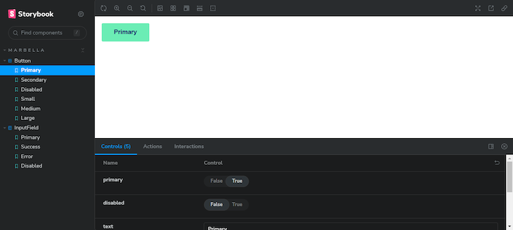
In the above image, you can see that in the left sidebar, we have our components defined in the story, including the types. In the center, you can see our button component with the options we included in the last code block. It continues:
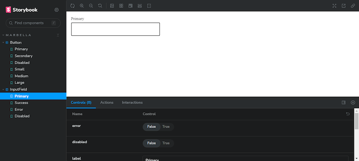
In this image, you can see the input component’s story types and properties. Now, you can play around with these options and see how the components behave in different scenarios. You can enhance these properties by installing some additional add-ons for Storybook.
You may face some issues when configuring Storybook due to missing dependencies like
babel. If you face any issues, go through the logs and install only the necessary libraries, or try downgrading the version of Storybook.
Testing with Jest and React Testing Library
Now, it’s time to add some testing for our component. First, install the dependencies to configure Jest and React Testing Library. You can execute the following command to install the dependencies:
npm install @testing-library/react @testing-library/jest-dom @testing-library/user-event jest @types/jest jest-environment-jsdom --save-dev
Here, we have installed Jest and testing-library along with several add-ons for them, like jest-dom and user-event, which enable Jest to render the components using the DOM for making assertions, and mock user events (like click, focus, or lose focus).
After installing the dependencies, create a jest.config.js file to hold the configurations for the tests. You can also use the Jest CLI to generate this file by running the following command:
npx jest --init
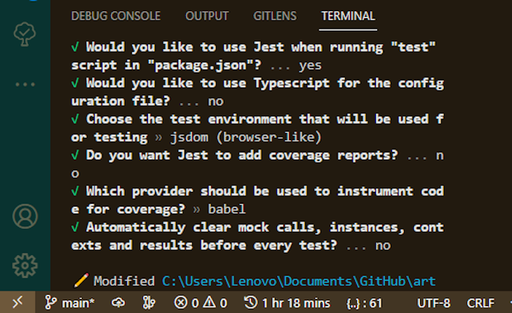
The above image is the console output that you will get when you use the Jest CLI. Now, let’s start writing the tests, starting with the button component. In the Button folder, create a Button.test.tsx file and include the following code in it:
import React from "react";
import '@testing-library/jest-dom'
import {render, screen } from '@testing-library/react'

import Button from "./Button";

describe("Running Test for Marbella Button", () => {

  test("Check Button Disabled", () => {
    render(<Button text="Button marbella" disabled/>)
    expect(screen.getByRole('button',{name:"Button marbella"})).toBeDisabled();
  });
});
In the above code, we are rendering the button component and checking if we are rendering the properties we defined (in this case, disabling the button). This particular test will pass if the rendered button is disabled.
Next, we can test the input component. Also, create an Input.test.tsx file in the Input folder and include the following code in it:
import React from "react";
import '@testing-library/jest-dom'
import userEvent from "@testing-library/user-event";
import {render, screen } from '@testing-library/react'

import Input from "./Input";

describe("Running Test for Marbella Input", () => {

  test("Check placeholder in Input", () => {
    render(<Input placeholder="Hello marbella" />)
    expect(screen.getByPlaceholderText('Hello marbella')).toHaveAttribute('placeholder', 'Hello marbella');
  });

  test("renders the Input component", async () => {
    render(<Input placeholder="marbella" />);
    const input = screen.getByPlaceholderText("marbella") as HTMLInputElement;
    userEvent.type(input, "Hello world!");
    await waitFor(() => expect(input.value).toBe("Hello world!"));
  });
});
In the above code, we have two test scenarios: one will render the input component with a prop placeholder, and the other will mock a user event of typing inside the component. Let’s execute the test through the following command:
npm run test
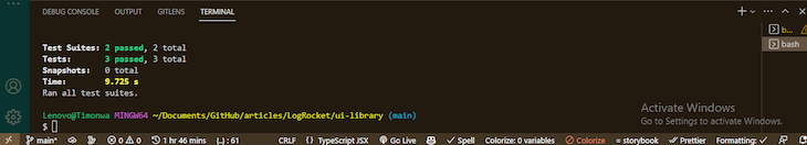
The above image shows the output of running the test with some metrics. All the tests we wrote passed. Yay!
Modifying the package.json dependencies
Now that we have finished building our library, we need to adjust our dependencies. Some packages currently installed as devDependencies should be moved to either peerDependencies or dependencies. As I said earlier, PeerDependencies are packages that the library needs to function properly in a project, while dependencies are packages that are required for the library to work as intended.
So, we need to redeclare the prop-types and styled-components packages as dependencies and the React and react-dom packages as peerDependencies, like so:
"dependencies": {
    "prop-types": "^15.8.1",
    "styled-components": "^5.3.10"
  },
  "devDependencies": {
    ...
  },
  "peerDependencies": {
    "react": "^18.2.0",
    "react-dom": "18.2.0"
  }
Packaging and publishing to npm
We’re all done! Now, we can publish this library as an npm package. To create and publish a package on npm, you will need to create an account on npmjs. When you create an account, search for your package name in npmjs just to see if it already exists because there may be packages with similar names. Next, begin the process of publishing your package by running the following command in the terminal:
npm login
This will prompt you to enter the username and password of your npm account. Do so, then run the build command again just to build the package for the last time. After building we can publish it as a package through the following command:
npm publish --access public
After successfully publishing your library, you should be able to see the published package on npm in your profile. And your package will be available for everyone to download!
Conclusion
In this article, we built a React library with TypeScript and used CSS-in-JS with some tools like Rollup, Storybook, and Jest. The code for this project can be found in this GitHub repository.
There are many ways to create component libraries, and there are a lot of starter templates available for you to create one. But building your own library from scratch gives you the opportunity to add or use the tools that you love the most, and it gives you in-depth knowledge on how build tools work. Thank you for reading this article! I would like to hear your thoughts in the comment section.